Diversity Dashboard
Timeline
January 2023 - August 2023
Responsibilities
Graphic Design
Data Analysis
Overview
In the last couple years, Jefferson has made great strides to increase diversity throughout its divisions (Hospital, University, Corporate, etc.). Our team was approached with designing an external facing infographic that communicates these statistics to visitors of the Jefferson website.
The infographic was started by another designer on my team and was handed off to me. In addition to designing, my work involved collaborating with the Director of HR and a Lead Business Analyst to gather the most accurate and up to date data.
My goal was to present data in a clean and informative manner while using the Jefferson brand colors for some creativity and personality.

Diversity Dashboard v1
The first iteration of the dashboard was created by another designer on my team. My introduction to this project was a meeting where he was presenting this to our primary stakeholder (the EVP of Diversity and Community Engagement).

Some requested edits included:
Adding a 4th column that compared gender and ethnicity breakdowns for both Jefferson patients and employees
Including definitions for terms such as Respected Culture and Respected SOGI
I also wanted to find a better way to emphasize the change in statistics for both Respected Culture and Respected SOGI between the 2022 Survey Year and the 2023 Survey Year besides using bar charts.

Diversity Dashboard v2
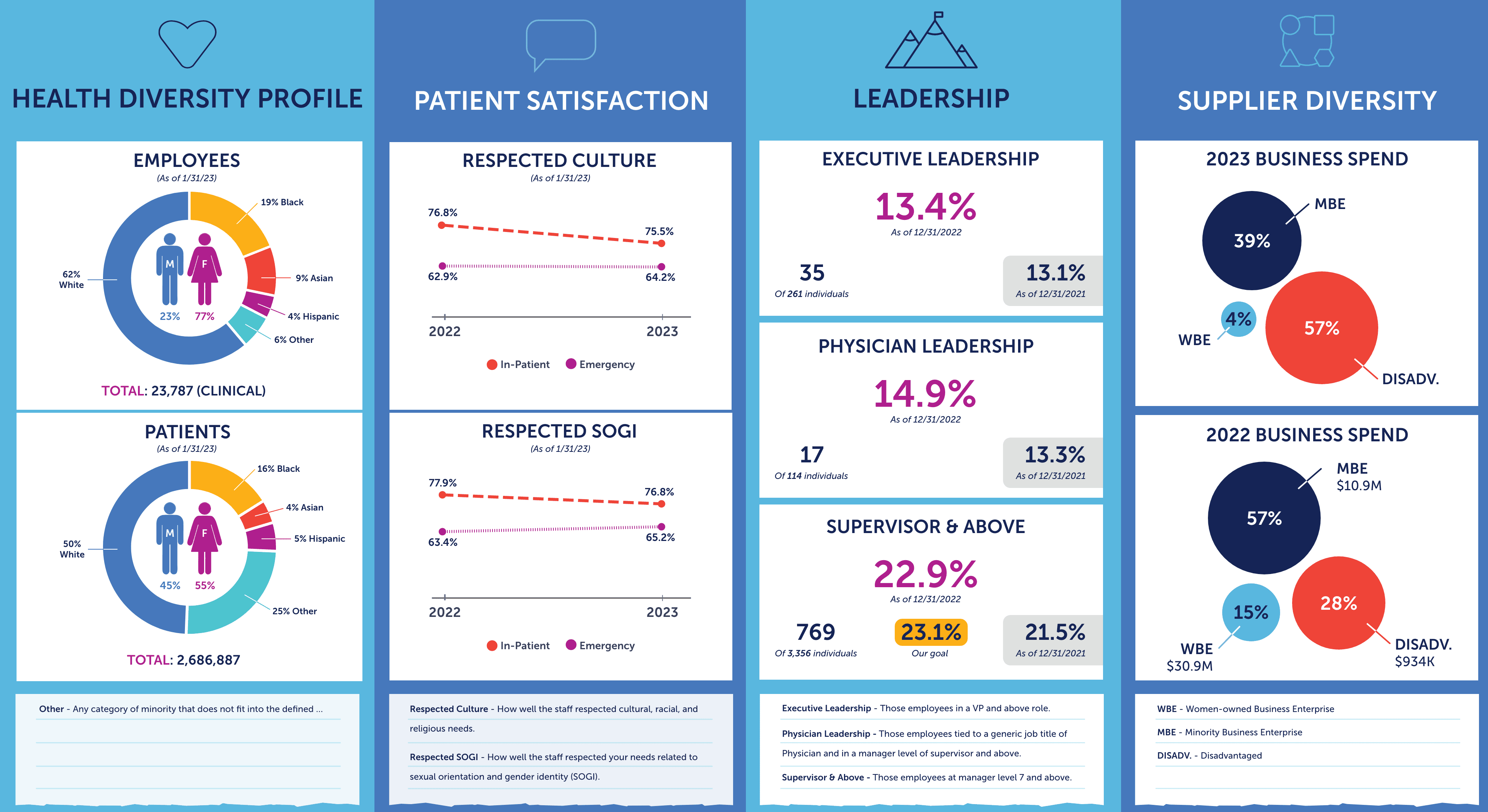
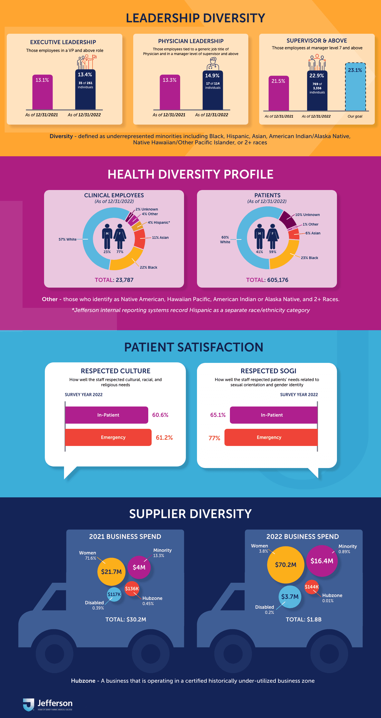
The biggest changes in this iteration was the addition of the Health Diversity Profile column and the revised data visualizations within the Patient Satisfaction column.
With the challenge of presenting many different categories of data in a limited space, I chose a pie chart comprised of Jefferson branding colors to illustrate the different ethnicities and have the gender breakdown within the center of each pie chart.
I also decided to use two line charts instead of the bar charts for Respected Culture and Respected SOGI within the Patient Satisfaction column to more clearly illustrate how the data changed over time, while also including different colors and line textures to distinguish between In-Patient and Emergency.

A Creative Pivot
At the beginning of the project, we were told that the infographic had very specific limitations around its dimensions based on the platform it would be on. It was this point when we were told that the infographic would now be a clickable image on the Jefferson website, which mean I could take more creative liberties with my design.
I decided to take the infographic in a different direction - one that was more fun and colorful to better engage visitors of the Jefferson website. Some questions I was considering as I approached this creative pivot:
Should the infographic be horizontally or vertically oriented?
How could large amounts of data be presented without being visually overwhelming?
In addition to the colors, what were other creative elements that could be included?
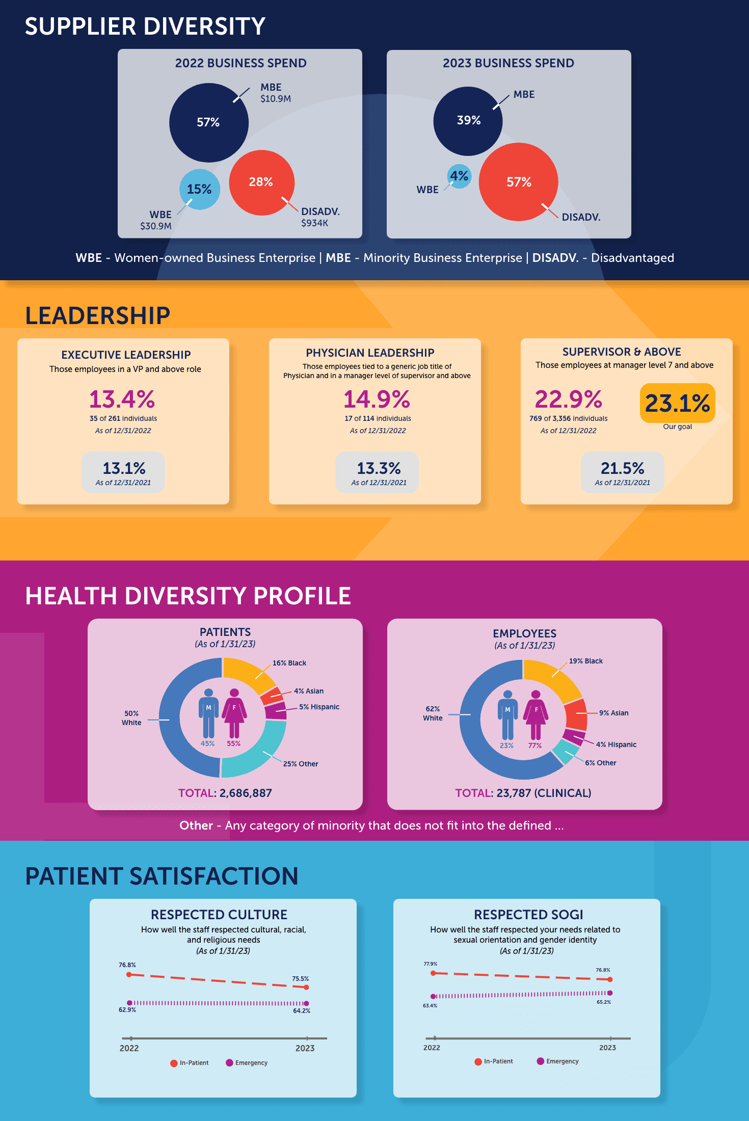
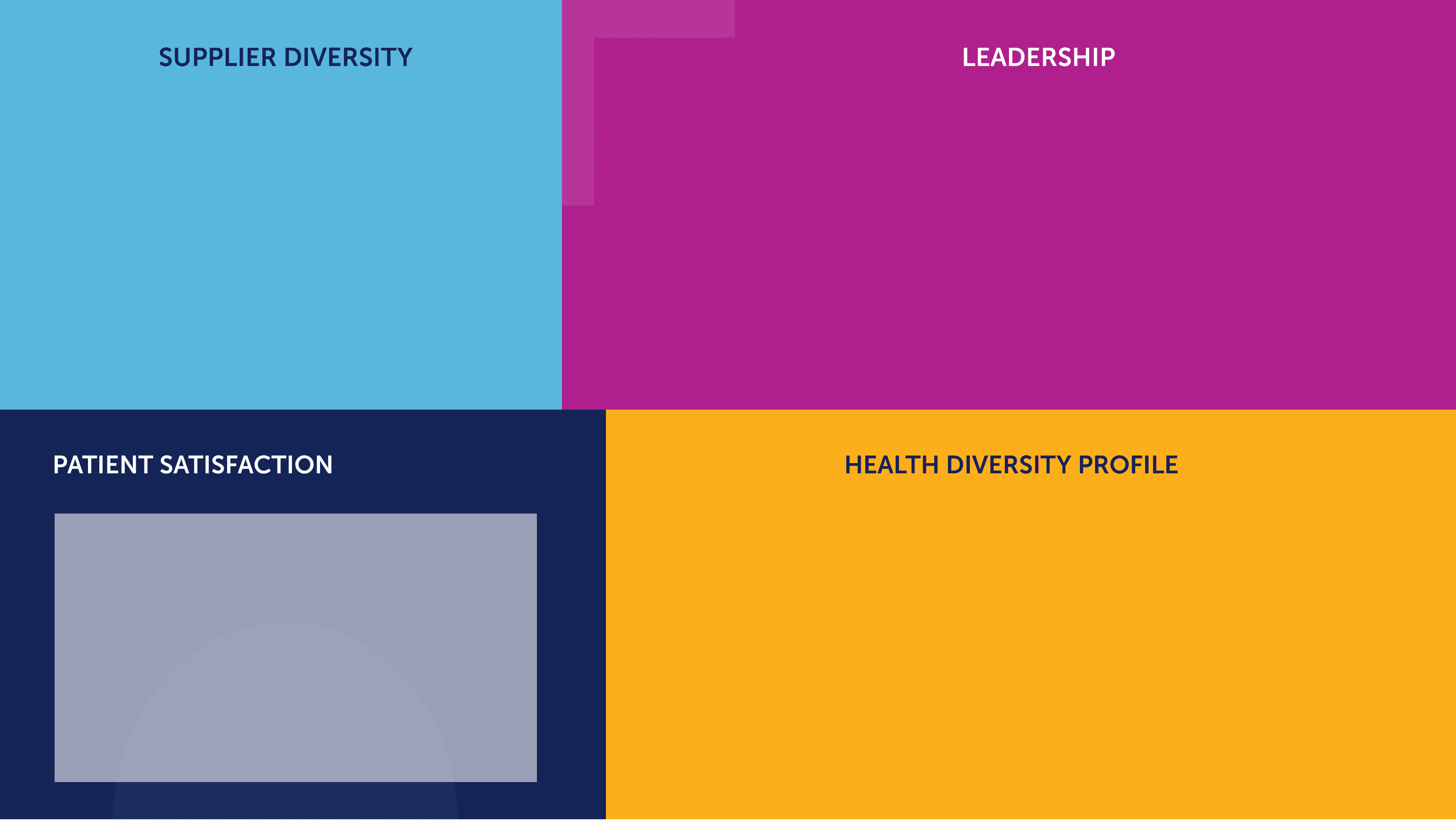
I opted to make the infographic vertical instead of the 2 x 2 template for a visually smoother user experience. Overall I was quite happy with how all the data visualizations turned out in this new format; however, I did still feel as if the infographic was missing something. I wondered if there was a way to leverage more creative elements to communicate how the diversity of each category ultimately comes down to the people within Jefferson.
Data Discrepancies
While the visual aspect of the infographic was in a good place, there were some stakeholder requests / feedback that posed some issues with the type of data we were collecting. Some examples include:
Health Diversity Profile: While we had data on the % of clinical employees who identified as Hispanic, we did not have the same data for our patients.
Respected Culture / Respected SOGI: Currently, the data sets being compared were 2022 and 2023. It was requested that we compare 2021 and 2022 instead, but we had no data available for either category in 2021.
Supplier Diversity: The categories we tracked changed from 2021 to 2022, meaning the stats were inconsistent across the two years (for example, “Disadvantaged” suppliers were tracked in 2022 but not in 2021).
My goal was to figure out how to resolve these discrepancies while also including more creative elements in the infographic.
“Absolutely stunning and phenomenal! I love this version, and I’d love to share it with the CEO tomorrow.”
- EVP of Diversity and Community Engagement at Jefferson
Our primary stakeholder had very positive things to say about the final version. To briefly summarize the changes made in each section:
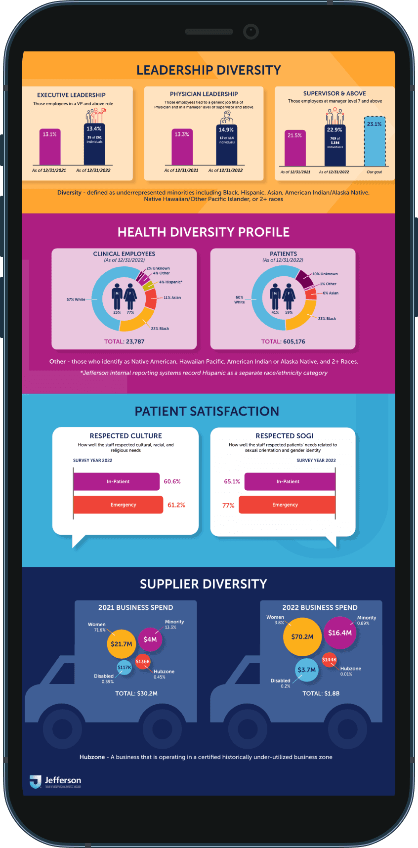
Leadership Diversity: I thought bar charts would better represent the positive growth in each of the three Leadership categories, and also included some vector icons to emphasize the “people” aspect of diversity.
Health Diversity Profile: I included a disclaimer that Hispanic was considered a separate category for employees
Patient Satisfaction: I kept the displayed data for just 2022 as that was the only year we captured both Respected Culture and Respected SOGI. I thought having the cards resemble chat bubbles was a fun nod to the results coming from patient surveys.
Supplier Diversity: I determined which supplier categories were consistent throughout 2021 and 2022, and illustrated the data we had on trucks to highlight the different suppliers that engaged with Jefferson.