Sponsorship Portal Rebuild
Timeline
Stakeholders
Jefferson Senior Vice President
Sponsorship Council within Office of the CEO
Overall Impact
Strategize allocation of Jefferson’s sponsorship funds with an automated portal that saves $2.5M per fiscal year
Overview
In an effort to fund charitable organizations and efforts that benefit the larger Philadelphia community, Jefferson has a Sponsorship Portal in which applicants can apply for funding for various events and programs. However, the current Sponsorship Portal needed to be rebuilt on a more reliable, updated system and also required enhancements that reflect the needs of the expanded Enterprise Sponsorship Committee.
As the Lead Product Designer on this project, I collaborated with developers and product managers to drive the redesign the effort of the current Sponsorship Portal. I also took on the role of leading QA Testing throughout the process.


Evaluating the Current Portal
There were three user types who interact with the Sponsorship Portal: Requestors, Committee Members, and Admins.

The current Sponsorship Portal was very outdated - not only in terms of aesthetics, but also its functionality. It would crash frequently and be an unreliable tool to track Sponsorship applications.
After talking to our stakeholders and brainstorming on the different flows for the three user types, my high priority areas of focus were:
Update and standardize the branding / UI elements across all pages
Designing features to assist all three user types in their goals of using the Sponsorship Portal
How could I make the application process easier for Requestors?
How could I make voting more seamless for Committee Members?
How could the tracking of multiple applications be more intuitive for Admins?

Wireframes to Mockups
The development team recommended that to facilitate the migration of the portal to a more functional platform, the portal should be split into two sites: the external Requestor site and the internal Admin and Committee site. In considering the design of the different pages, I thought first about the functionality and the features before including colors and other UI design elements.
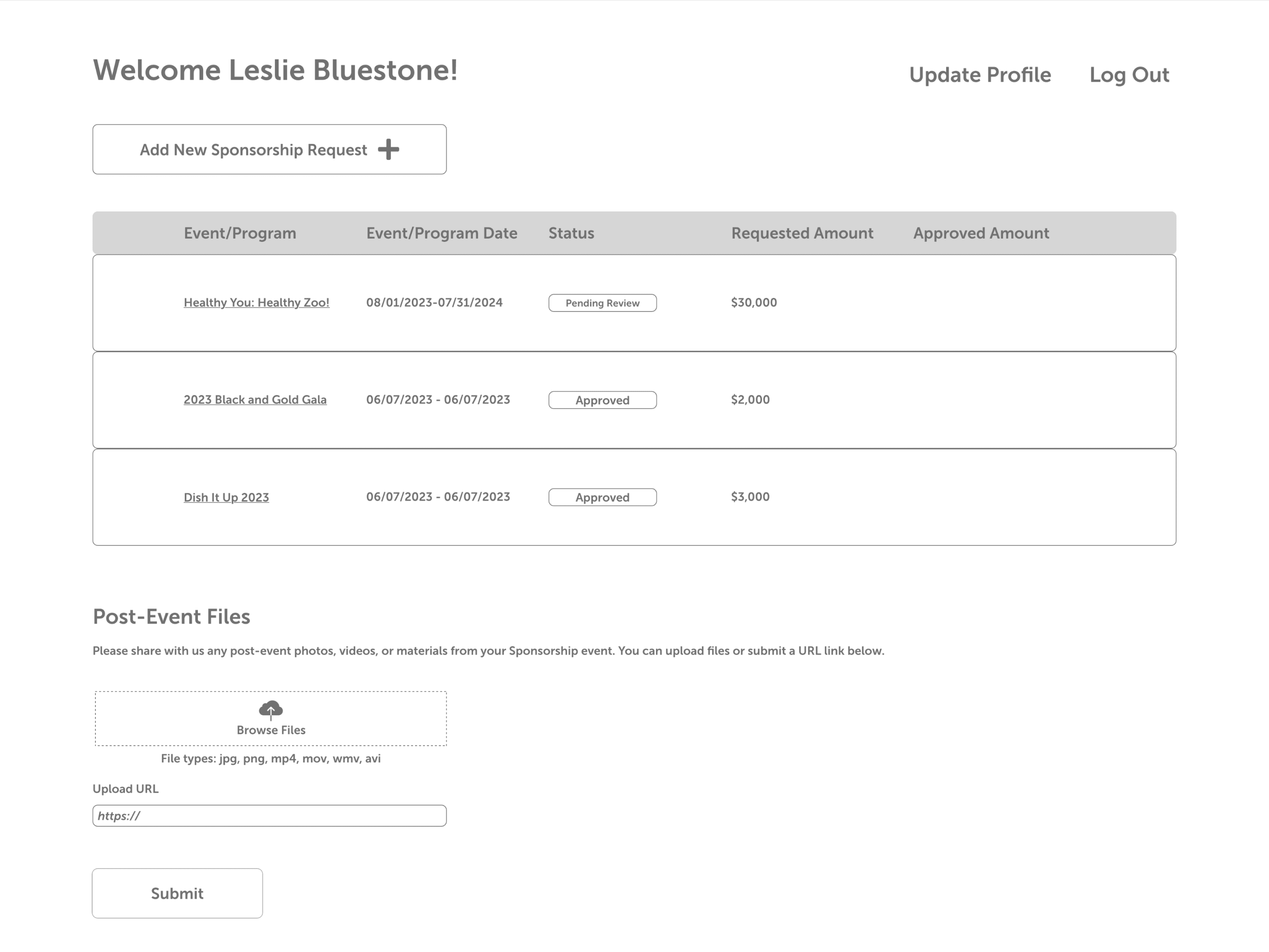
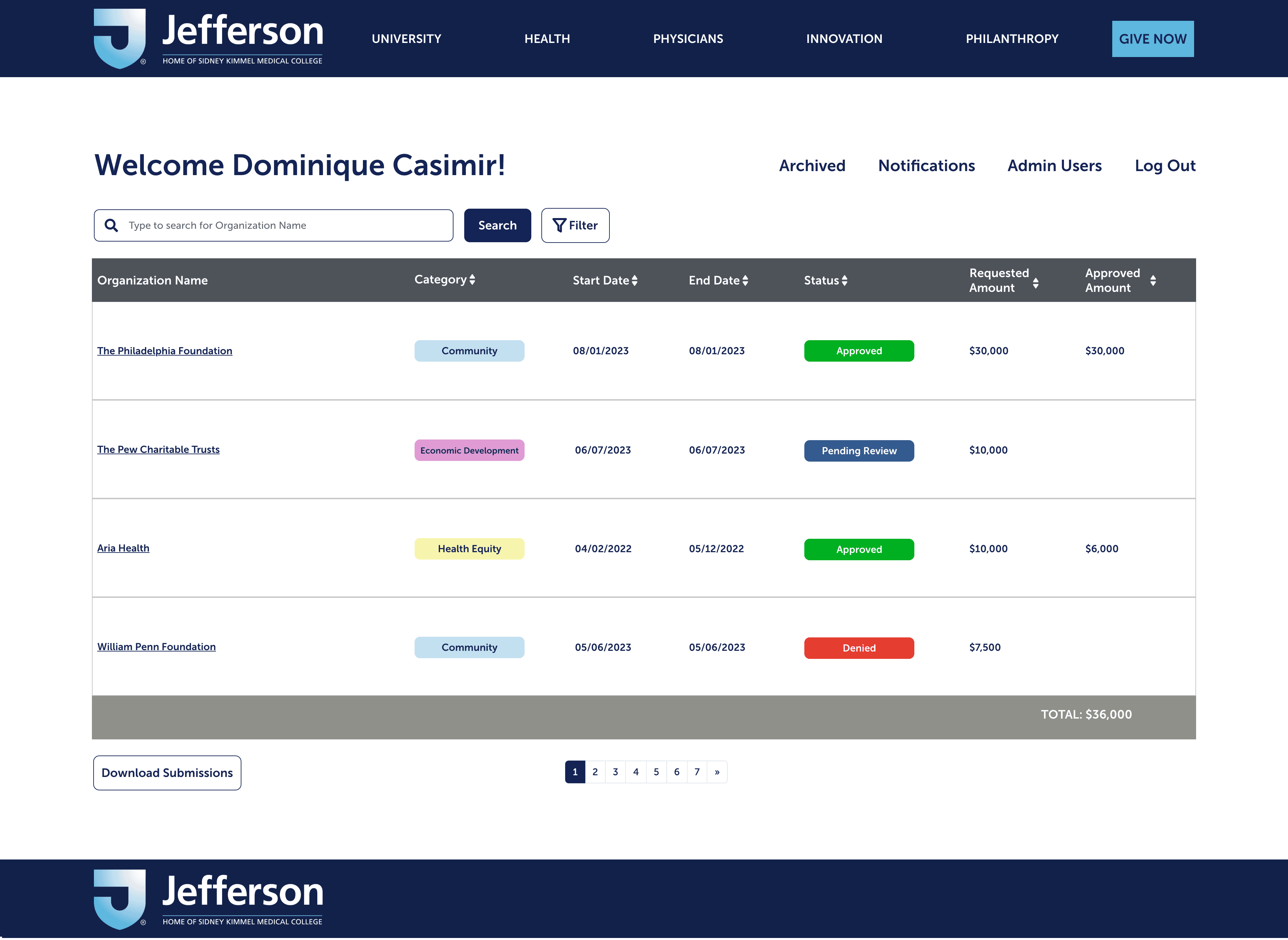
Requestor Home Page
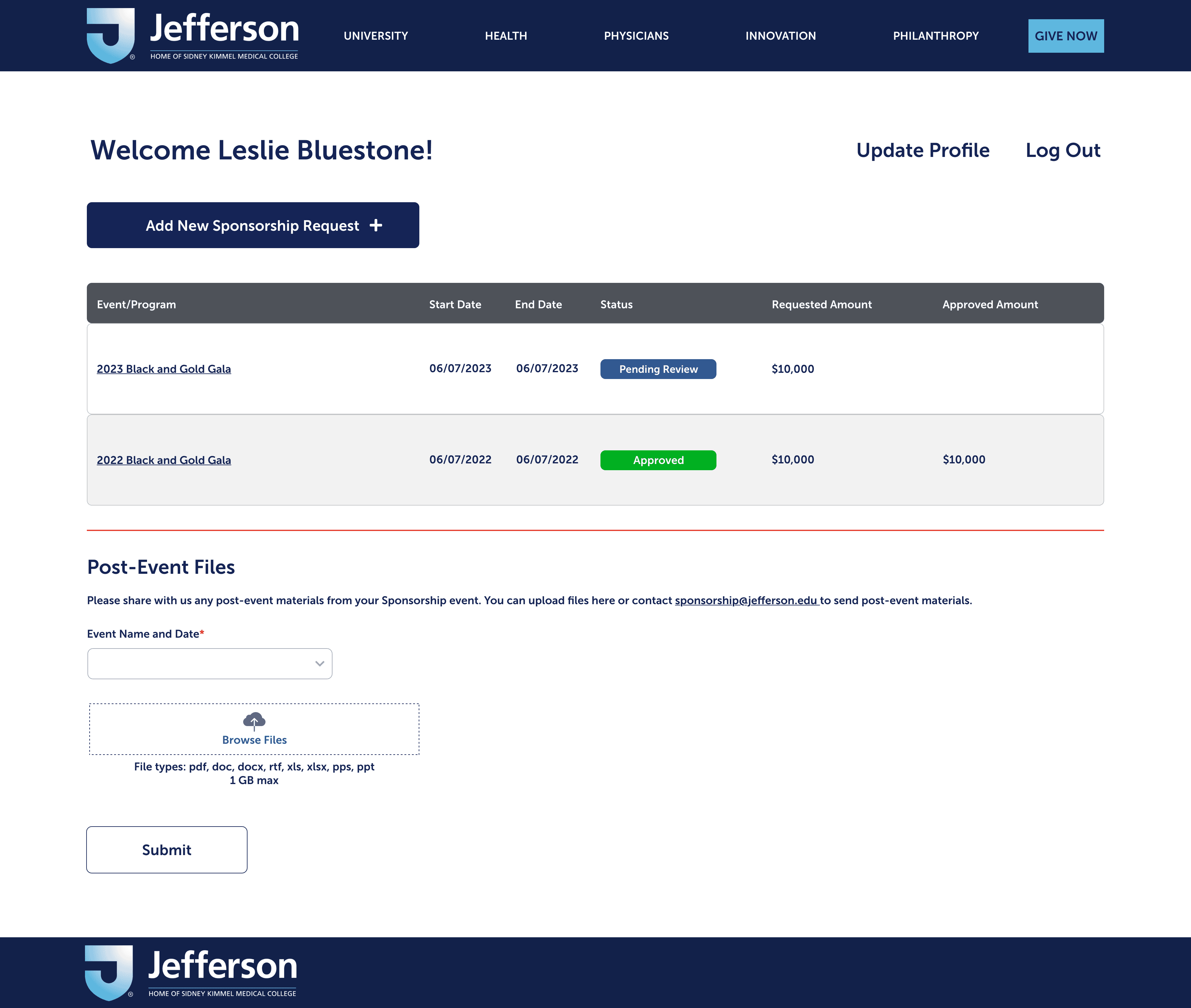
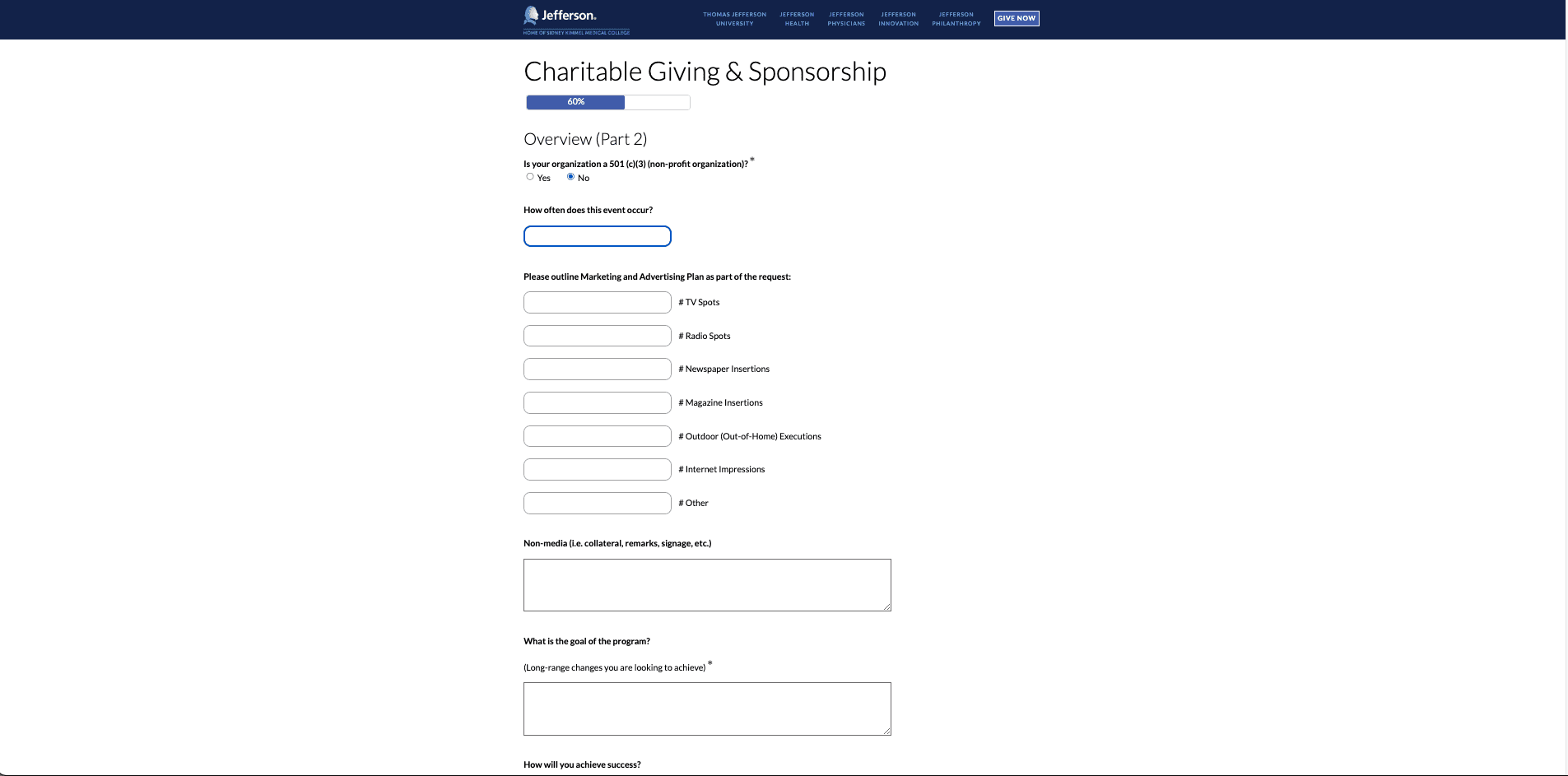
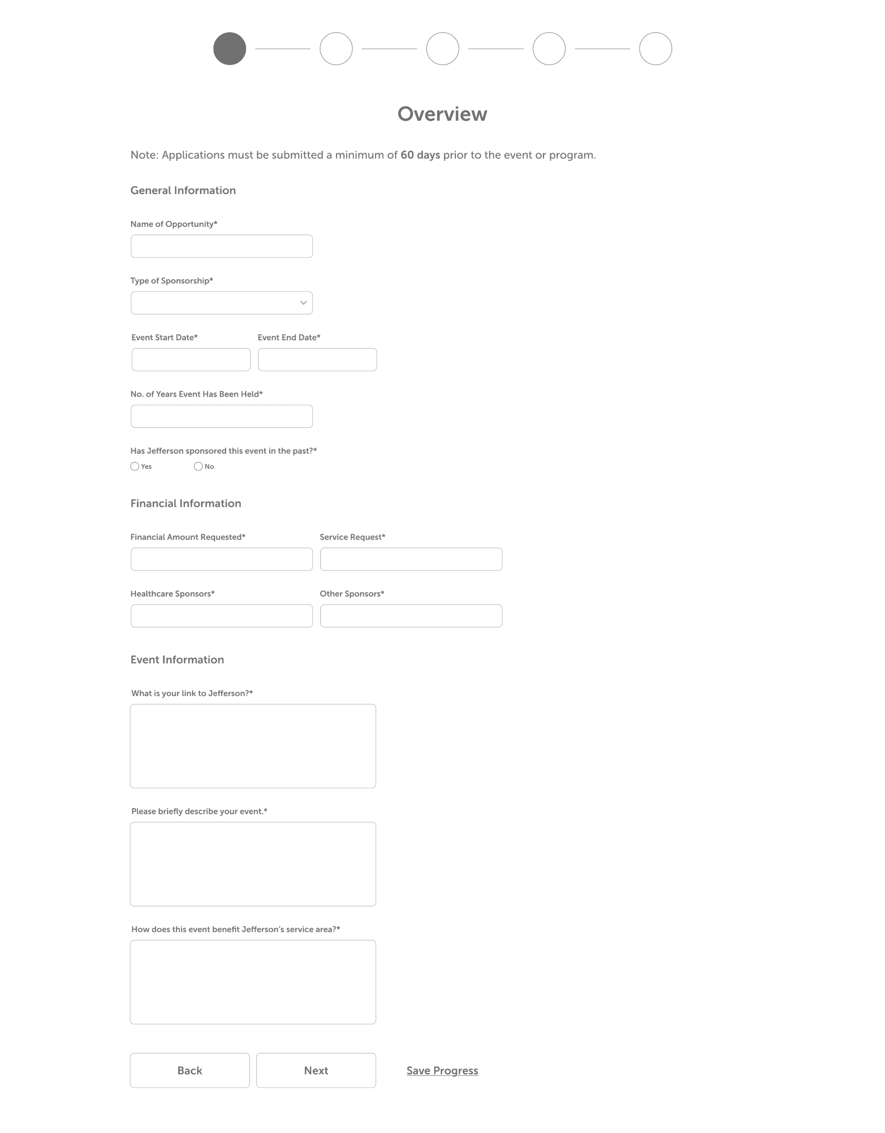
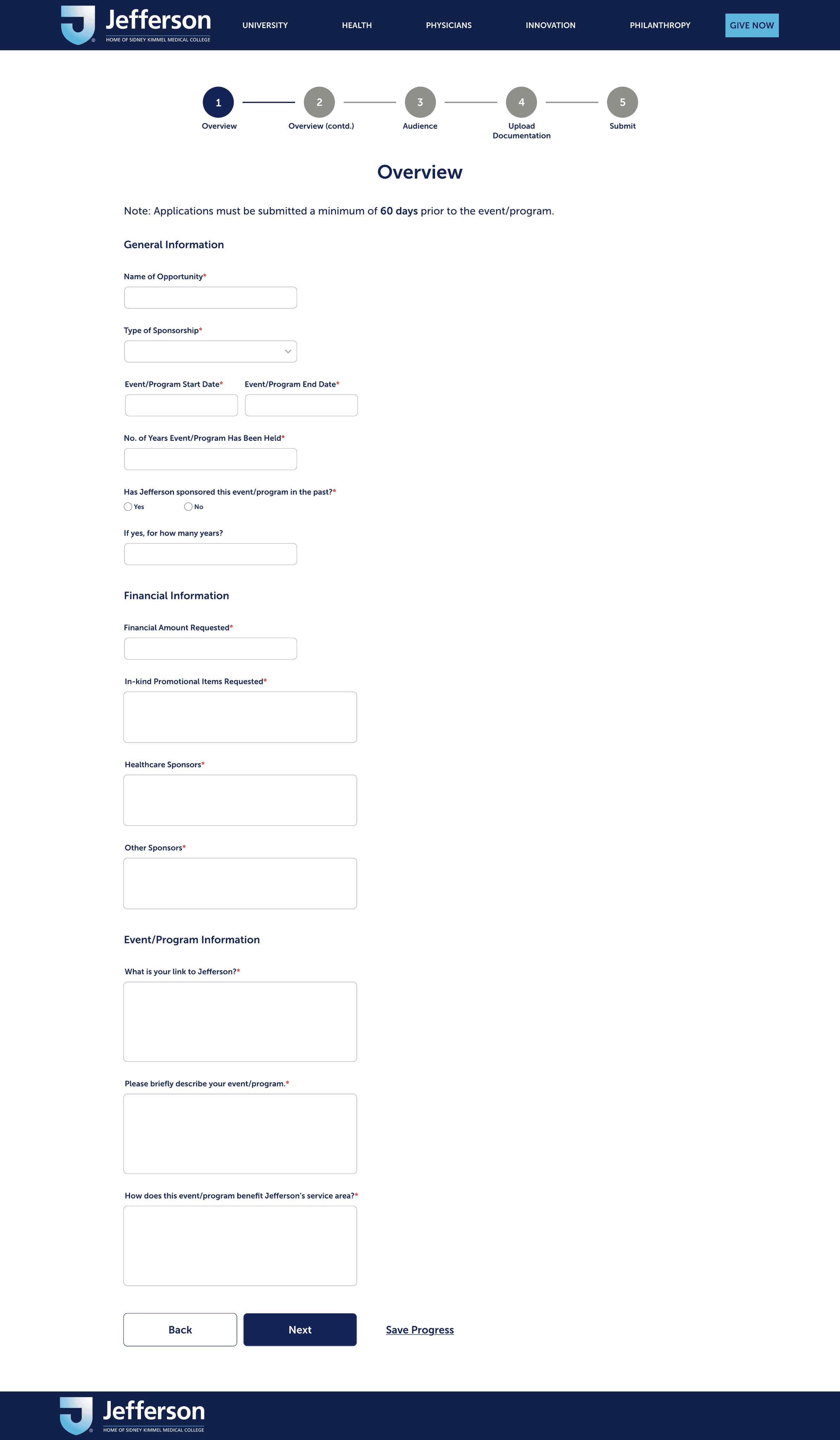
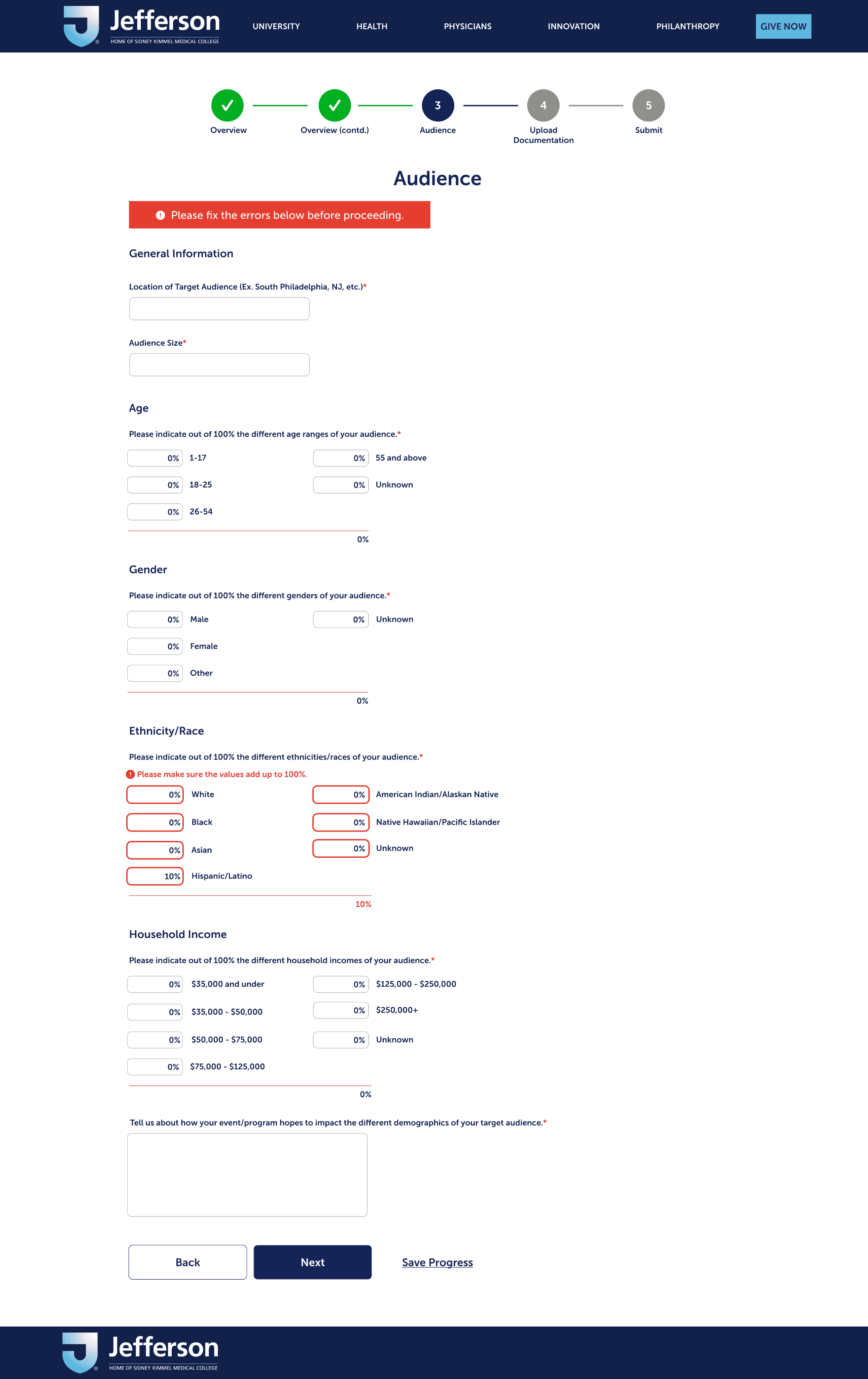
Requestor Application
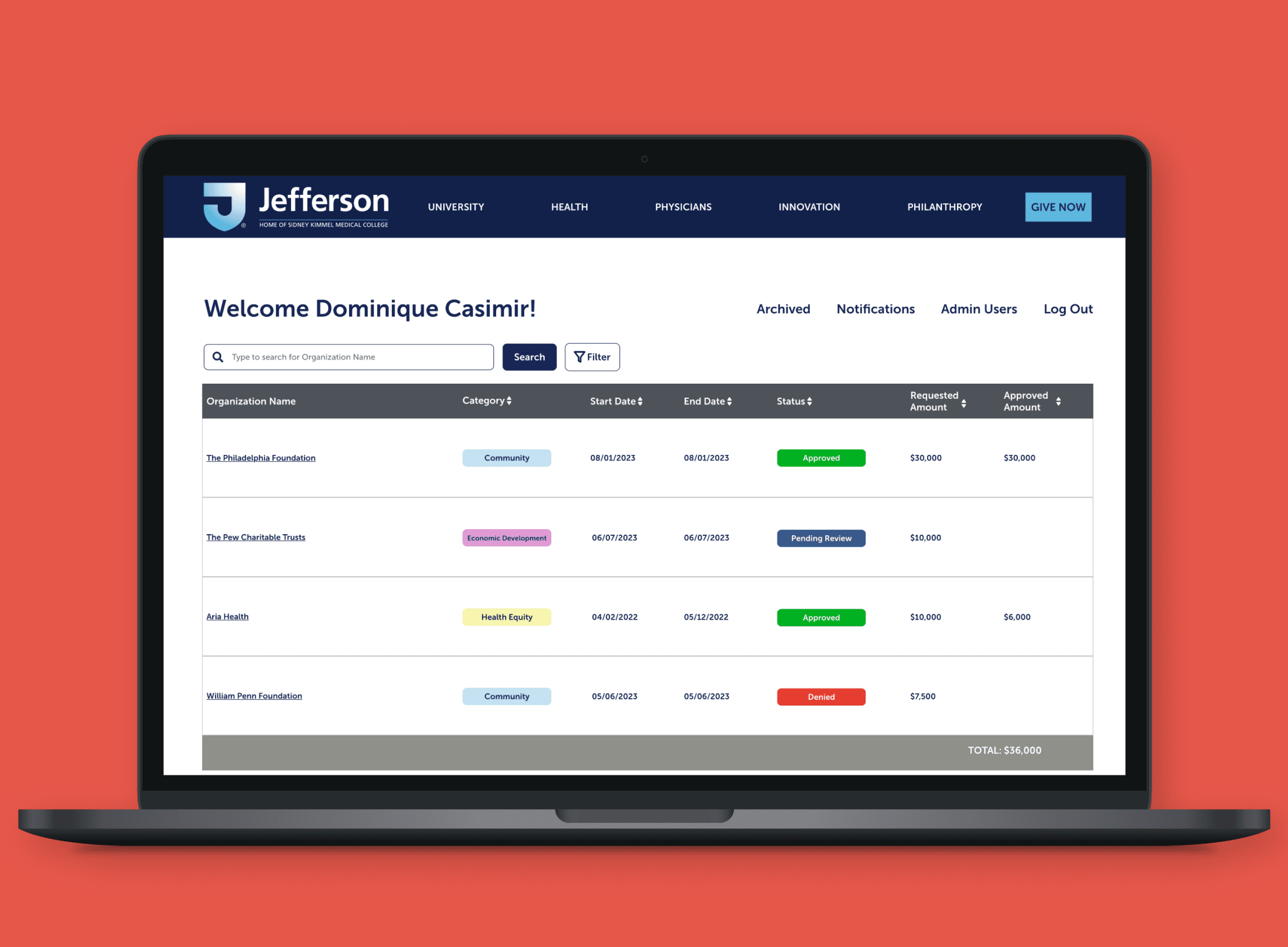
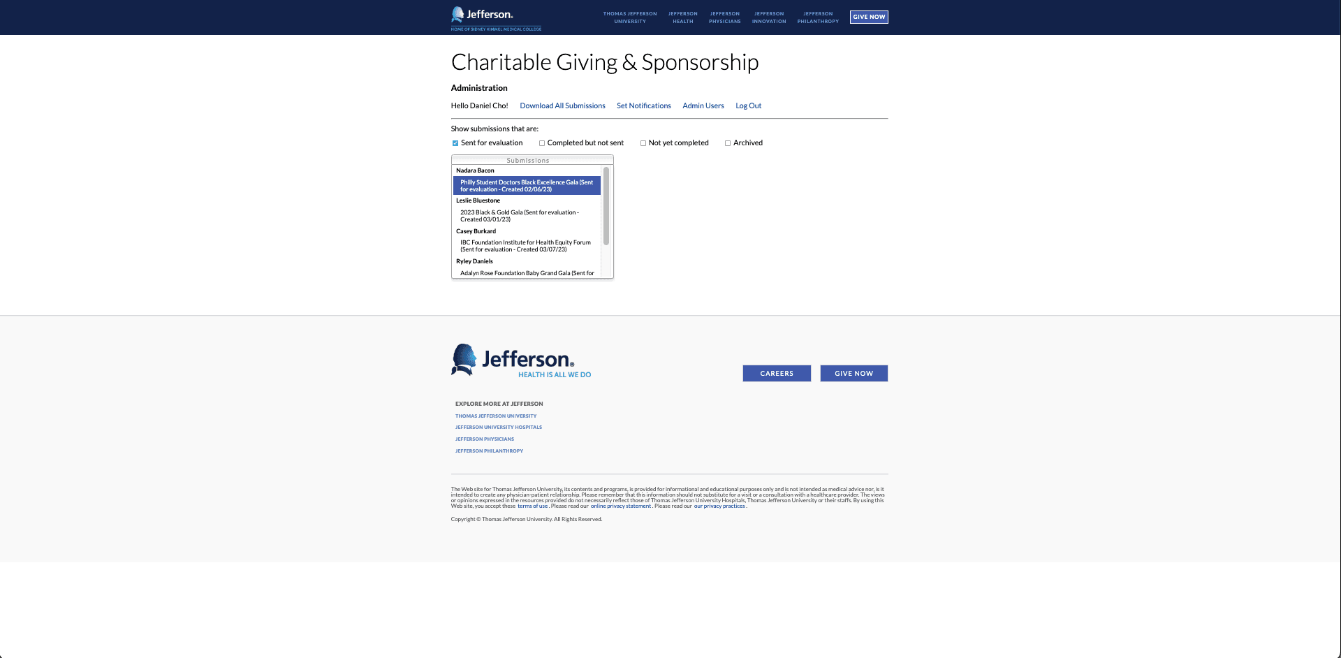
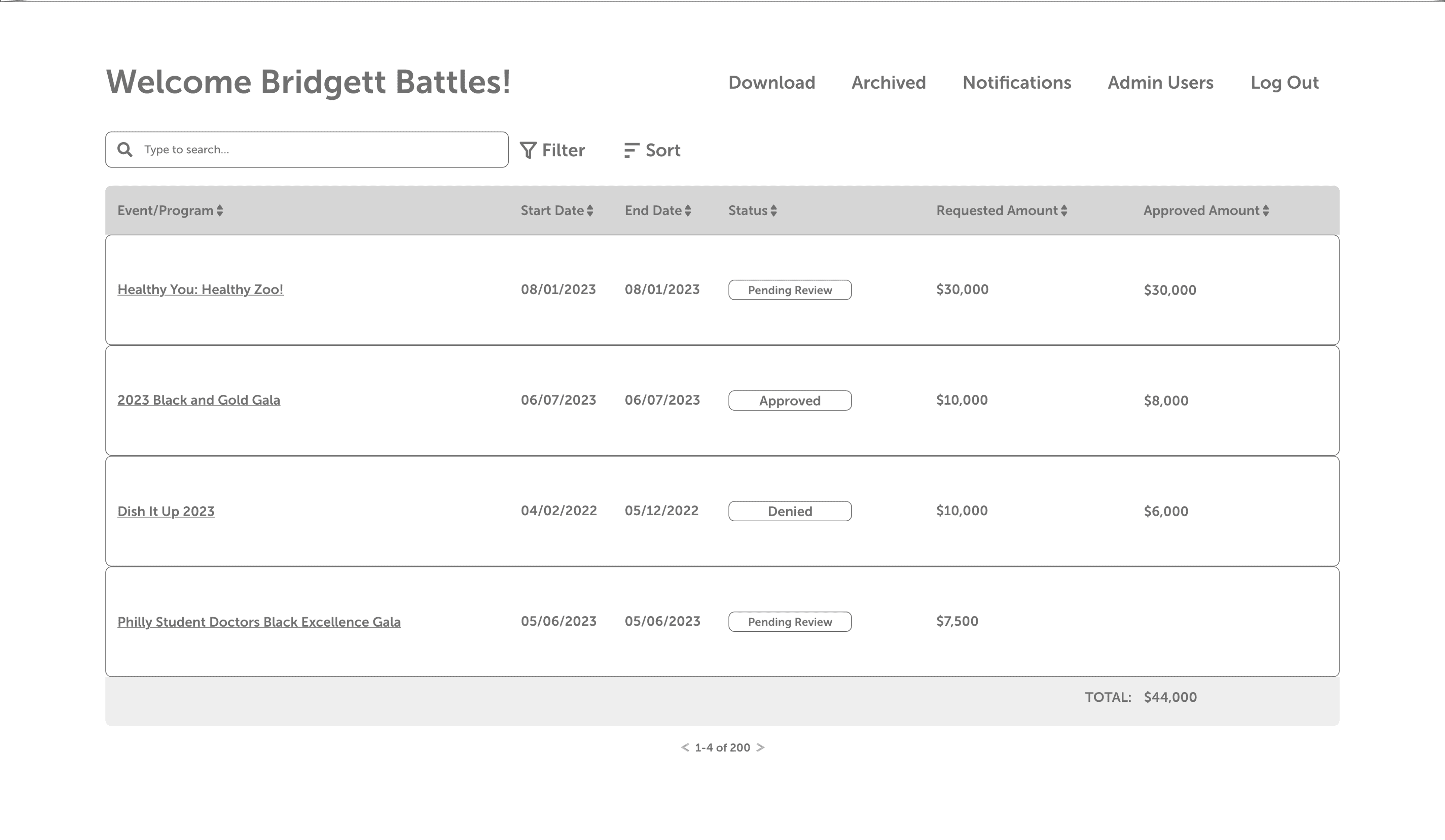
Committee/Admin Home Page
Refining the Designs
Error Messaging
One valuable lesson I learned while handing off my designs to developers was the importance of considering edge cases; beyond the “happy” path, what were all the possible case scenarios when a user interacts with a page?
With this project, that pertained specifically to error messaging and led me to think about how it could diminish user frustration and instead allow them to accomplish the task at hand.
Filter Feature
Something I’m personally proud of designing from the ground up was the filtering functionality. With the goal of improving the workflow of both Committee and Admin users, I wanted to make sure that it accounted for all the properties available on the table while being simple and intuitive to use.
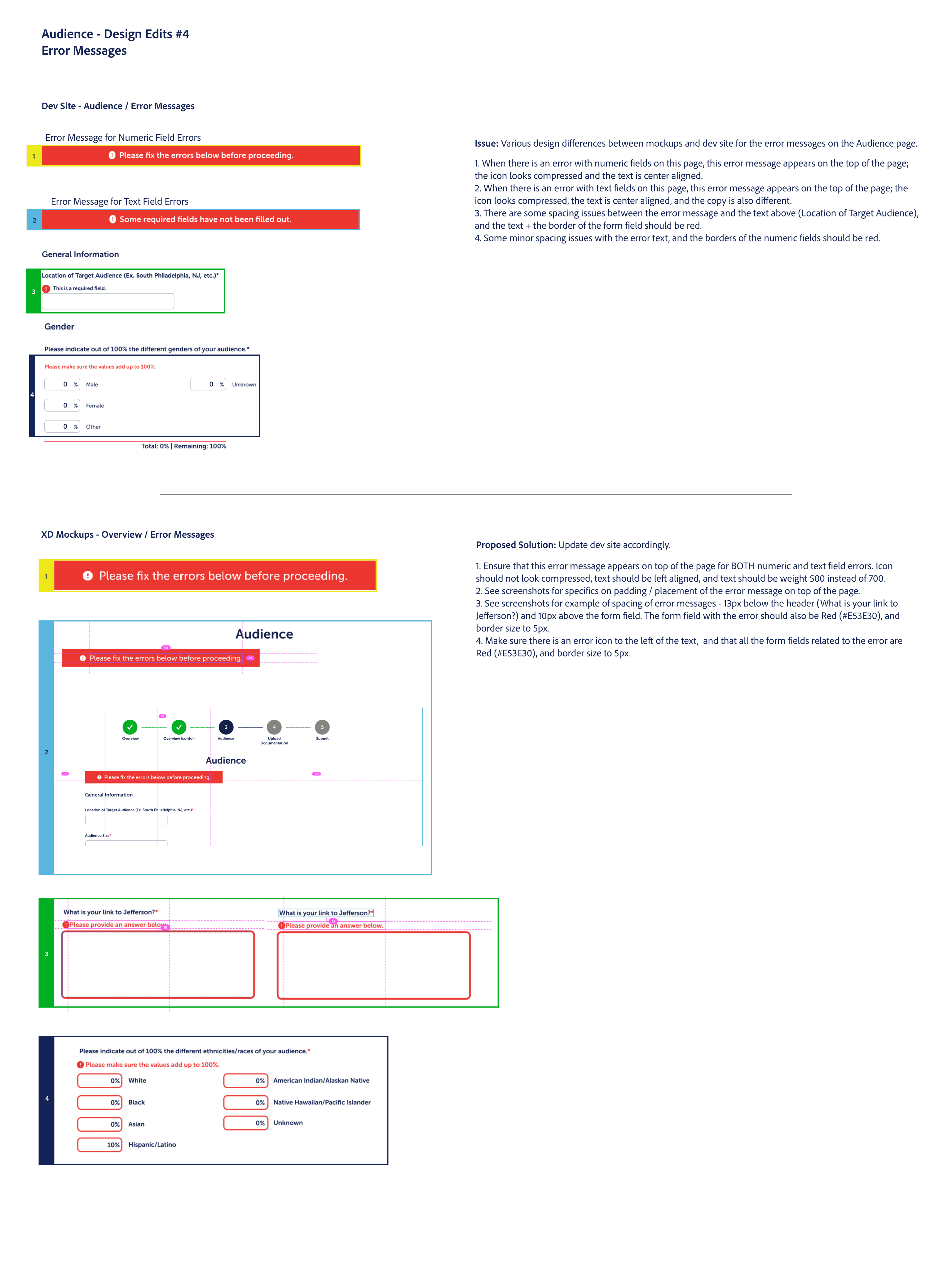
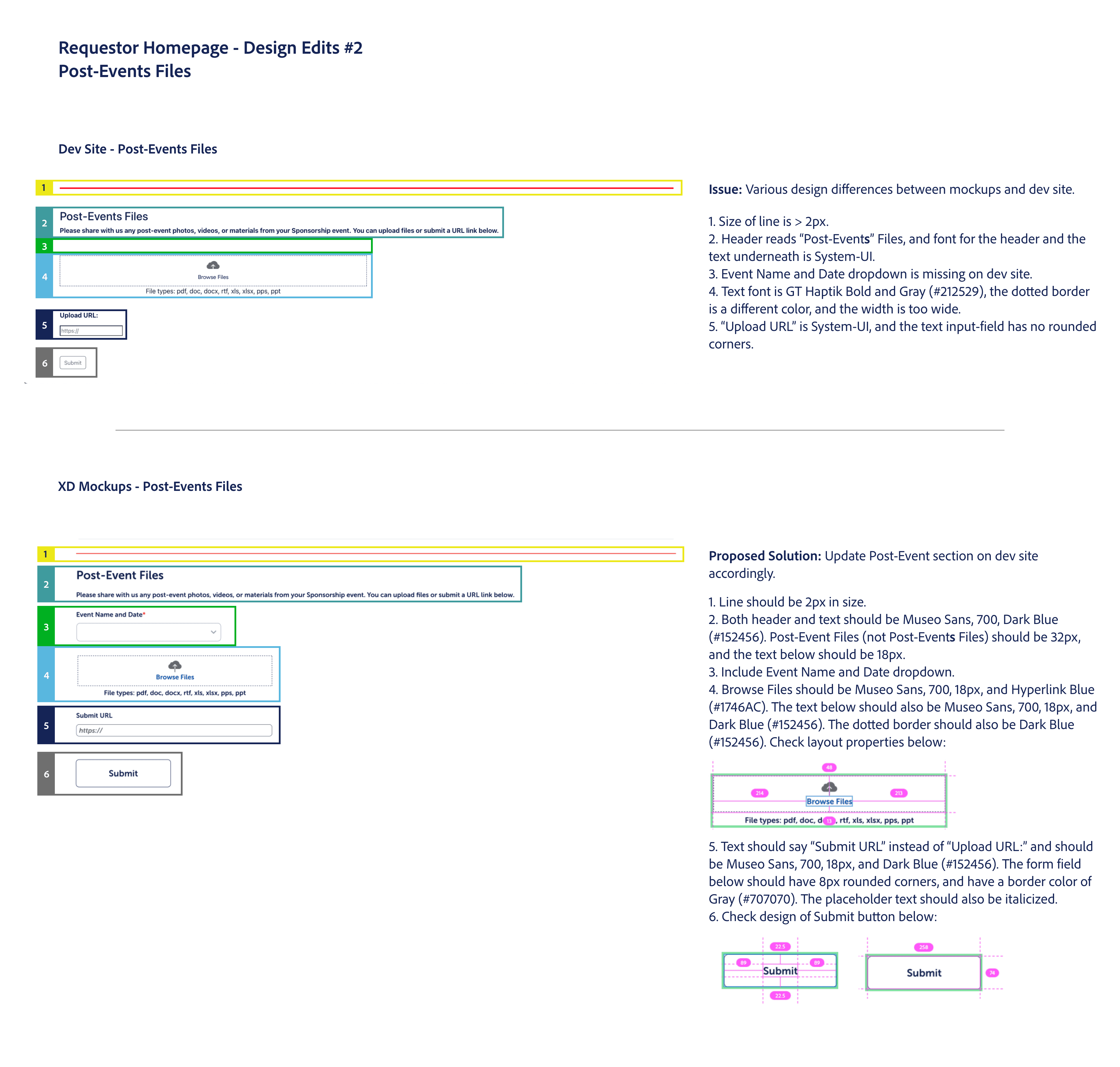
QA Testing
In addition to leading the redesign effort, I was also responsible for the QA Testing process. After a developer would merge requests onto the live sites, the product manager would write out the user stories / test cases, and then I would go and conduct QA on the pages while logging all required changes and edits.
I decided to create comprehensive documents that showed the issues and proposed solutions to ensure clear communication with the developers.
Reflections
Both the Requestor and the Admin/Committee site are live, and helping to facilitate the Sponsorship process by saving $2.5M of leakage per fiscal year. It was both a daunting and fulfilling experience to take lead on designing a project on this scale. Some lessons I learned were around:
Handoff to Development: Sprints within Agile are mostly to gauge technical effort, so I have a better understanding of how to fit my designs to this framework and what kind of supplementary information is necessary with my mockups (edge cases, button states, etc.)
Different user types: To create intuitive experiences that would appeal to all users, I found that it was important that I constantly think about the needs and requirements of the three user categories throughout the entire process.